Bonophi: A Bold Display Font for Modern Web Design
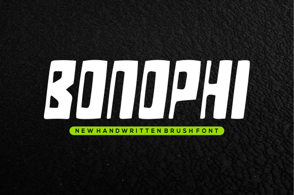
As a UI designer who ships digital products daily, I pay close attention to how typography shapes user perception before a single word is read. Bonophi stands out—not just visually, but functionally—in the display font category. It’s contemporary without being trendy, bold without sacrificing clarity, and expressive without compromising professionalism. Its letterforms balance geometric confidence with subtle organic warmth—think sharp terminals paired with open counters and generous x-heights that hold up beautifully on screens.
Bonophi excels where first impressions matter most: hero sections, landing page headers, and branded banners. On a SaaS product page, pairing Bonophi with a clean sans serif like Inter or Manrope instantly establishes visual hierarchy—the display font commands attention for the headline (“Launch Your Idea in 48 Hours”), while body copy remains scannable and frictionless. That contrast isn’t decorative; it’s behavioral design. Users parse information faster when typographic roles are clear.
For online stores—especially boutiques, creative studios, or wellness brands—Bonophi adds distinctive brand tone without leaning into cliché. Unlike overly ornate script fonts or sterile tech sans serifs, Bonophi carries personality you can trust: confident but not aggressive, fresh but not fleeting. Use it for shop category headers (“Handcrafted Ceramics”, “Limited Edition Prints”) or promotional banners (“Spring Edit Live Now”). Its strong vertical stress and consistent stroke weight ensure legibility even at smaller sizes on mobile viewports—provided you reserve it for short, high-impact phrases.
Readability in context matters more than specs alone. Bonophi performs best at 32px and above on desktop, 28px+ on tablets, and 24px minimum on mobile—always with adequate line spacing (1.2–1.35) and generous letter-spacing (+20–40 units) to prevent visual crowding. Avoid using it over busy image overlays unless you apply a subtle text shadow or solid background tint. On dark mode interfaces, test contrast carefully: Bonophi’s medium-weight variants meet WCAG AA at 18pt+ against #121212, but lighter weights may require background reinforcement.
This isn’t a workhorse font for paragraphs or data tables—and it shouldn’t be. Bonophi is purpose-built as a display font: a strategic accent, not ambient noise. Think of it as your brand’s voice amplifier. Use it for logo lockups (where its uppercase strength shines), section dividers (“Our Process”, “Client Stories”), CTA buttons (“Get Started”, “Join the Waitlist”), and testimonial highlights. Skip long-form headlines like “How Our Sustainable Packaging Reduces Carbon Footprint by 42%”—that’s asking too much of any display typeface. Save Bonophi for the hook, not the explanation.
Pairing Bonophi thoughtfully unlocks its full potential. My go-to combination is Bonophi (Bold or ExtraBold) + Inter (Regular or Medium) for web interfaces—clean, accessible, and rhythmically balanced. For editorial or portfolio sites aiming for refined contrast, try Bonophi with a low-contrast serif like Literata or Cormorant Garamond. The key is maintaining tonal alignment: if your brand feels energetic and modern, avoid heavy transitional serifs that introduce unintended formality. If your site uses variable fonts, confirm Bonophi includes web-optimized WOFF2 files and supports common OpenType features like stylistic alternates or case-sensitive forms—these details affect polish at scale.
On responsive layouts, Bonophi adapts cleanly across breakpoints—but only when applied intentionally. I avoid setting it as a global heading font across h1–h6. Instead, I scope it to specific components: .hero-title, .feature-card__label, .cta-button--primary. This keeps CSS maintainable and prevents unintended hierarchy clashes. In Figma or Sketch, I use Bonophi only in high-fidelity mockups—not wireframes—so teams understand where typographic emphasis belongs before development begins.
Licensing is non-negotiable in practice. Bonophi is a commercial font, and its license must explicitly cover web embedding (via @font-face or third-party hosts like Google Fonts or Adobe Fonts). If you’re building templates for clients or selling digital products like Notion kits or Shopify themes, verify the license permits redistribution. Some display fonts restrict usage to personal projects or capped monthly pageviews—those limits break silently in production, leading to fallback-font surprises mid-campaign. Always download from the official source and retain license documentation alongside your design assets.
I’ve used Bonophi across contexts where tone and trust intersect: a coaching website’s “You’re Ready” headline (paired with Lato for bio text), a digital course sales page banner (“Enroll Before Doors Close”), and a creative agency’s portfolio filter labels (“Branding”, “UI/UX”, “Motion”). In each case, Bonophi didn’t just look good—it signaled intention. Users didn’t just see words; they registered confidence, curation, and care. That’s the quiet power of a well-placed display font: it makes your digital space feel deliberately inhabited, not algorithmically assembled.
For bloggers launching a newsletter or marketers designing social-first landing pages, Bonophi offers distinction without complexity. Its character set covers Latin-based languages thoroughly, and recent updates include extended diacritics for European markets—useful if your audience spans multiple regions. Just remember: display fonts earn their place through restraint. One strong Bonophi headline per screen, anchored by reliable supporting typography, builds consistency far more effectively than scattering it across every heading level.
If your current web typography feels safe but forgettable—or worse, generic—Bonophi is worth testing not as decoration, but as a deliberate tone-setting tool. It won’t fix weak messaging or poor UX flow. But when aligned with thoughtful layout, smart pairing, and intentional sizing, it becomes part of what makes your digital experience feel unmistakably yours.