Block-link: A Bold Display Font for Digital Brand Impact
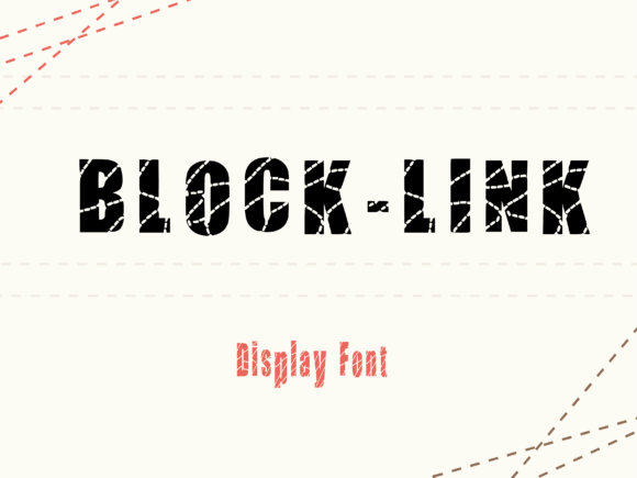
As a UI designer who ships landing pages, SaaS dashboards, and e-commerce experiences, I reach for display fonts not just to decorate—but to direct attention, reinforce tone, and accelerate recognition. Block-link stands out in that category: a tightly crafted display font where every letter is built from interlocking rectangular forms and subtle chain links. It’s geometric without being sterile, bold without sacrificing structure, and edgy without leaning into gimmickry. That balance makes it unusually versatile across digital surfaces—especially when used with intention.
Where Block-link Earns Its Place on Screen
Block-link isn’t designed for paragraphs or navigation labels. Its strength lies in high-impact, low-frequency use: hero headlines, section dividers, CTA buttons, product name treatments, and brand lockups. Because each glyph carries visual weight and rhythm through its modular construction, it performs exceptionally well at larger sizes—even on mobile viewports—where clarity and instant legibility matter most.
In practice, I’ve used Block-link for:
- A boutique online store’s seasonal campaign banner—paired with a clean sans serif body font, it anchored the visual hierarchy while reinforcing the brand’s modern, tactile aesthetic.
- A creative portfolio site’s “Work” section header—its structural confidence subtly echoed the precision of the design work shown beneath.
- A coaching website’s primary headline (“Clarity Starts Here”)—the chain-link motif quietly suggested connection and continuity, aligning with the service’s core message.
- A course sales page’s pricing tier badge (“Premium Tier”)—its compact geometry made the label feel substantial and intentional, not decorative filler.
Readability & Responsiveness: Practical Considerations
Block-link remains highly legible down to ~36px on desktop and ~28px on mobile—provided contrast is strong. On light backgrounds, it works best with dark gray (#222) or black text. On dark interfaces, use crisp white or a high-contrast accent color (not low-saturation pastels). Avoid thin strokes or soft shadows that blur the chain-link joints; those details are part of its identity and need definition.
For image overlays, apply a subtle semi-opaque background behind the text block—not just a drop shadow—to preserve shape integrity. And never stretch or skew Block-link: its proportions are calibrated. If you need width variation, rely on the font’s native condensed or extended variants (if included), not CSS transforms.
Font Pairing for Digital Clarity
Block-link thrives alongside typefaces that offer neutrality and breath. I default to pairing it with a humanist sans serif—like Inter, Poppins, or Manrope—for body copy, form labels, and supporting UI text. Their open counters and consistent x-height create a grounded counterpoint to Block-link’s assertive geometry.
For editorial or luxury-facing sites, a restrained serif like Lora or Crimson Pro adds gravitas without competing. Avoid pairing Block-link with other display fonts, script fonts, or overly geometric sans serifs (e.g., Montserrat Black)—those combinations risk visual noise or tonal confusion. The goal is contrast in function, not competition in style.
Brand Tone, Trust, and User Engagement
Typeface choice signals intent before a single word is read. Block-link conveys structured creativity—think architecture studios, hardware startups, design toolkits, or education platforms that value precision and forward motion. Its chain-link motif implies connectivity, reliability, and engineered thought—not randomness or whimsy. That subtext supports trust-building in conversion-critical areas like pricing tables or signup headers.
Crucially, Block-link doesn’t sacrifice professionalism for personality. Unlike many decorative display fonts, it avoids exaggerated terminals or unpredictable spacing. Its metrics are optimized for web rendering, and its kerning pairs are tuned for common two-letter combinations (e.g., “CT”, “UX”, “AI”)—a detail that matters when your headline reads “Build Your UX Flow”.
Licensing, Formats, and Real-World Deployment
Before embedding Block-link in a live project, verify its license covers your use case: commercial websites, client work, SaaS platforms, and digital templates all require explicit webfont or desktop + web licensing. Most reputable vendors provide WOFF2 files optimized for fast loading, along with fallback options and CSS @font-face kits ready for modern frameworks.
Check whether the package includes stylistic alternates (e.g., tighter chain links, alternate ‘g’ or ‘a’), multiple weights (Light, Regular, Bold), or multilingual support (Latin Extended, basic Cyrillic). If your audience spans regions or languages, confirm coverage early—no point selecting a font that can’t render “café” or “naïve” correctly.
When to Use Block-link—and When Not To
Use Block-link for:
- Hero section headlines (max 6–8 words)
- Section titles with clear visual separation (e.g., “How It Works”, “What Clients Say”)
- Branded buttons where emphasis matters more than density (“Get Started”, “See Plans”)
- Logo lockups where the brand name is short and benefits from structural reinforcement
- Animated micro-interactions—its modular shapes animate cleanly via SVG or CSS transforms
Avoid Block-link for:
- Body copy, captions, or data tables
- Small interface elements (e.g., tab labels under 14px)
- Long-form blog post titles with complex punctuation
- Accessibility-critical labels where screen readers may struggle with unconventional glyph construction
Block-link won’t replace your system font—but it will sharpen your visual voice where it counts. In an ecosystem crowded with safe choices, it offers distinction without compromise: a display font built for digital clarity, brand cohesion, and deliberate impact.